Lafz Personal Care Collection
Bringing out its Soulful Essence
Care That Begins with a Belief
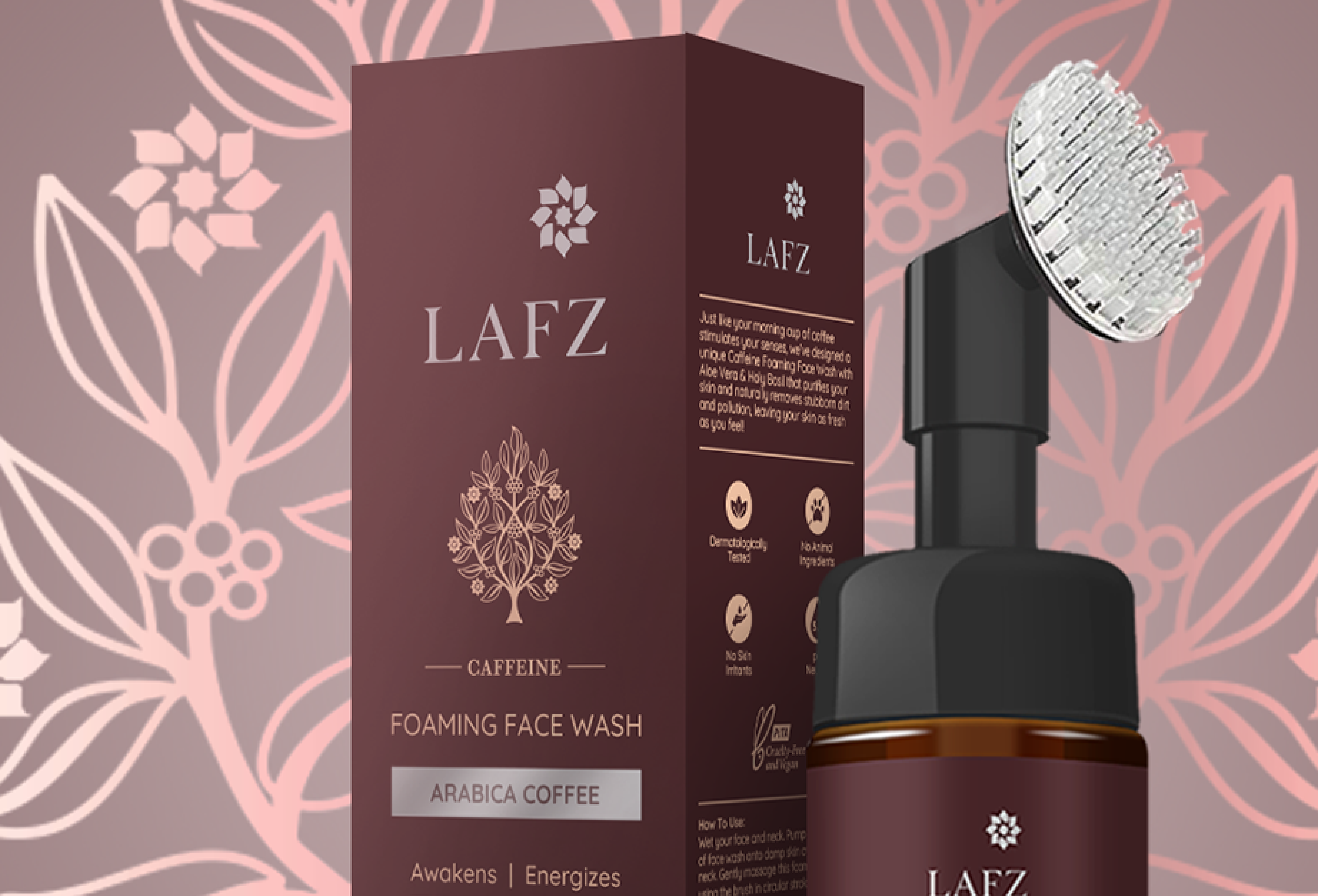
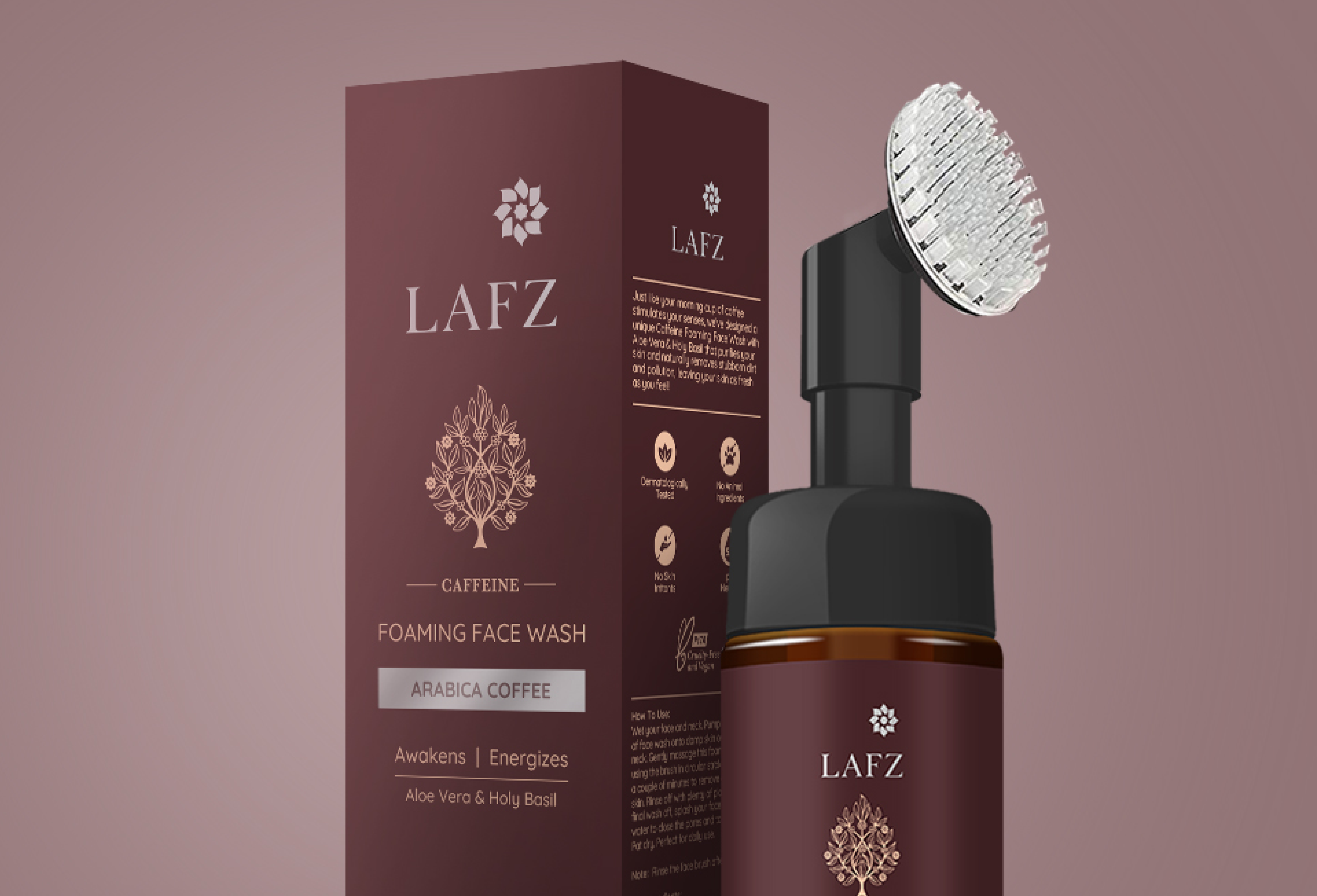
Lafz occupies a positioning in the Indian personal care market that is simultaneously simple and demanding: a brand that believes what you put on your skin should be as carefully considered as what you put in your body. The packaging had to carry that belief with the conviction of a brand that means it not as a wellness trend it is participating in, but as an actual commitment it is making. Studio ABD designed the Lafz personal care packaging system around this conviction: that the packaging of a clean, considered product should itself be clean and considered, and that any visual decision that contradicts the product's values is a small form of dishonesty.
Natural Without the Cliché; Contemporary Packaging for the Indian Wellness Market
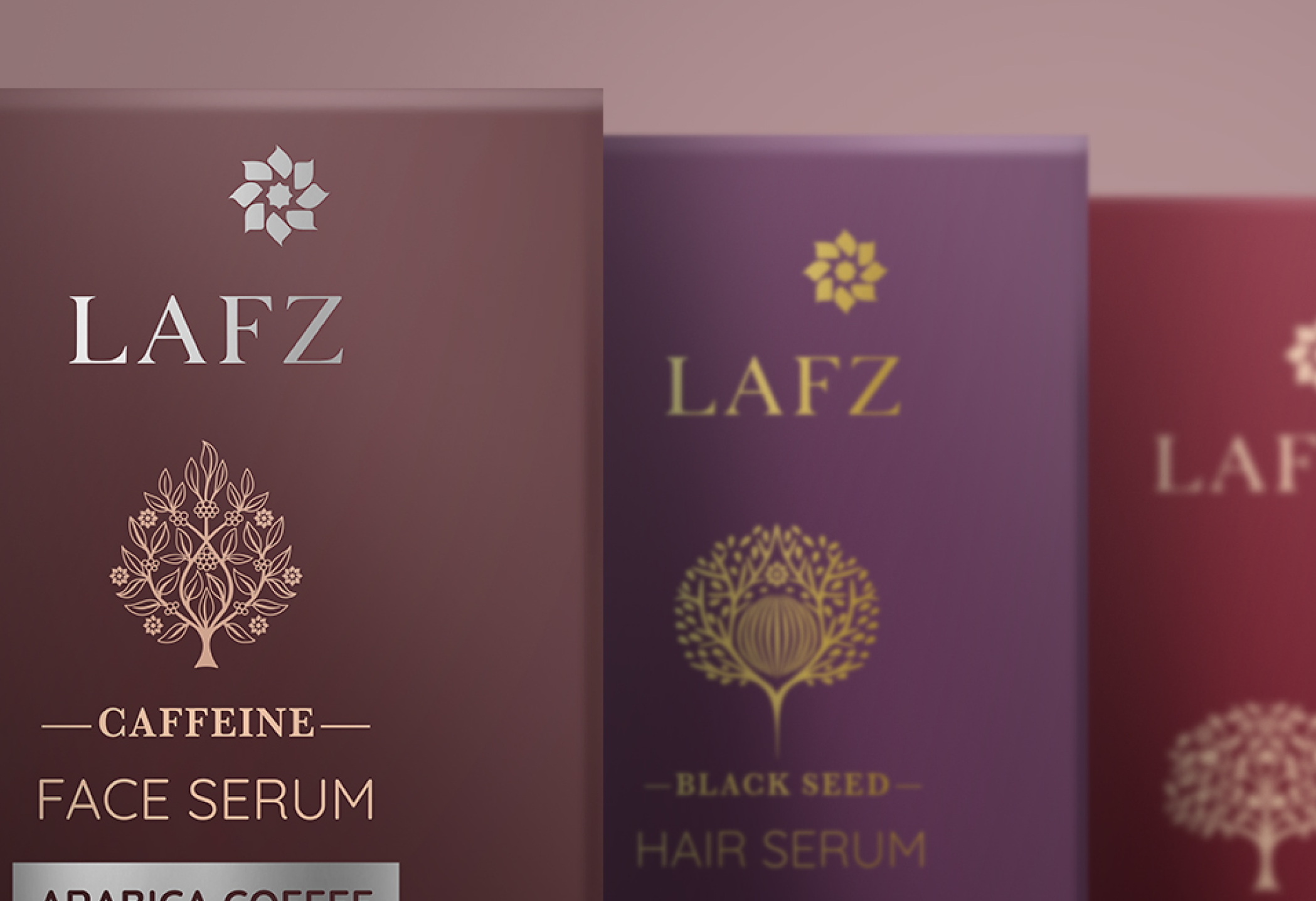
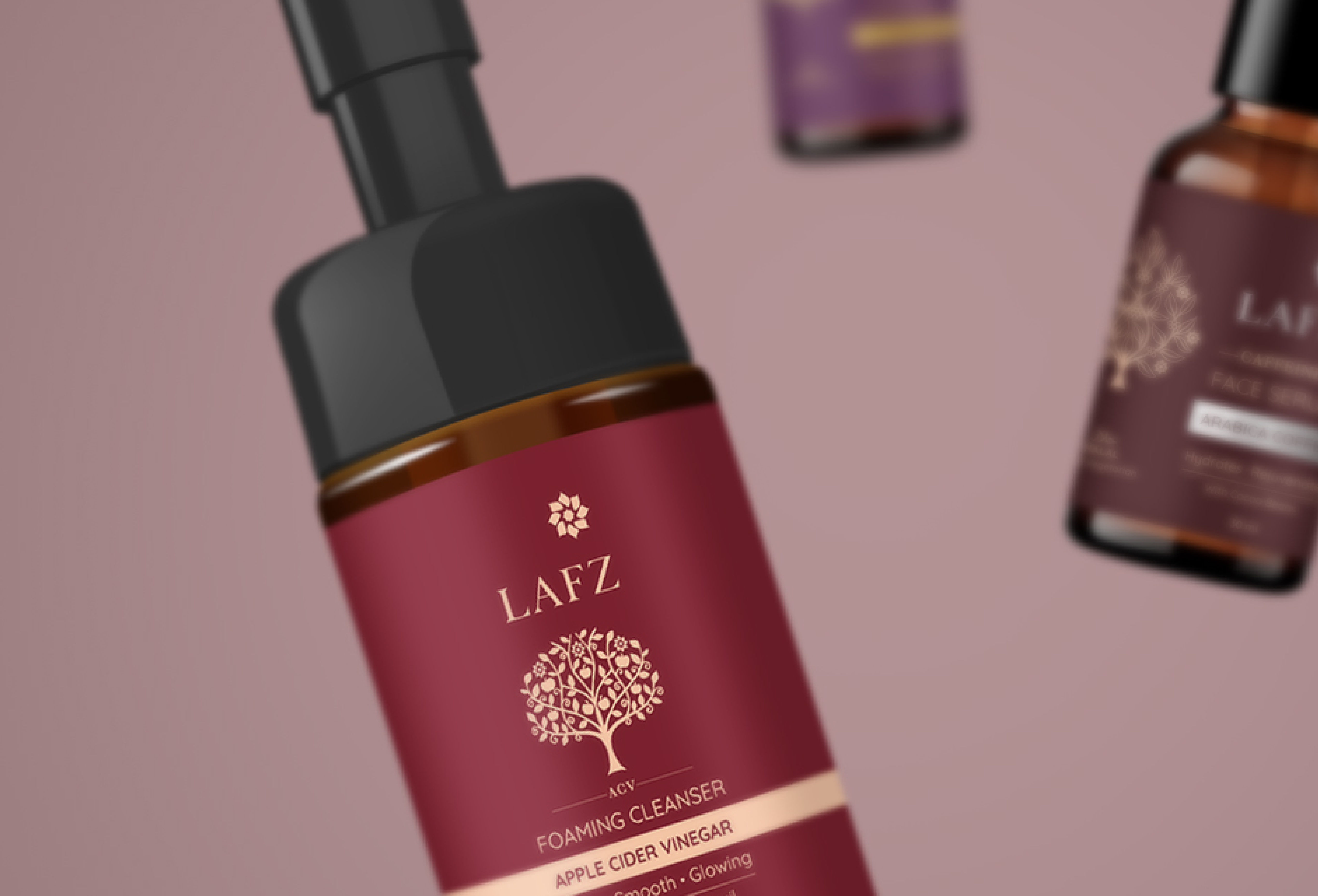
The challenge that faces every natural personal care brand is a visual one: the clichés of the category kraft paper, muted earth tones, hand-drawn botanical illustration have become so ubiquitous that they now communicate generic rather than genuine. Lafz needed to look natural and honest without looking like every other natural and honest brand on the shelf. Studio ABD's solution was to pursue a contemporary visual language that communicates the values of the brand clean ingredients, considered formulation, genuine care through typographic rigour and structural clarity rather than through category-expected visual markers. The result is packaging that is unmistakably Lafz rather than unmistakably 'natural brand'.
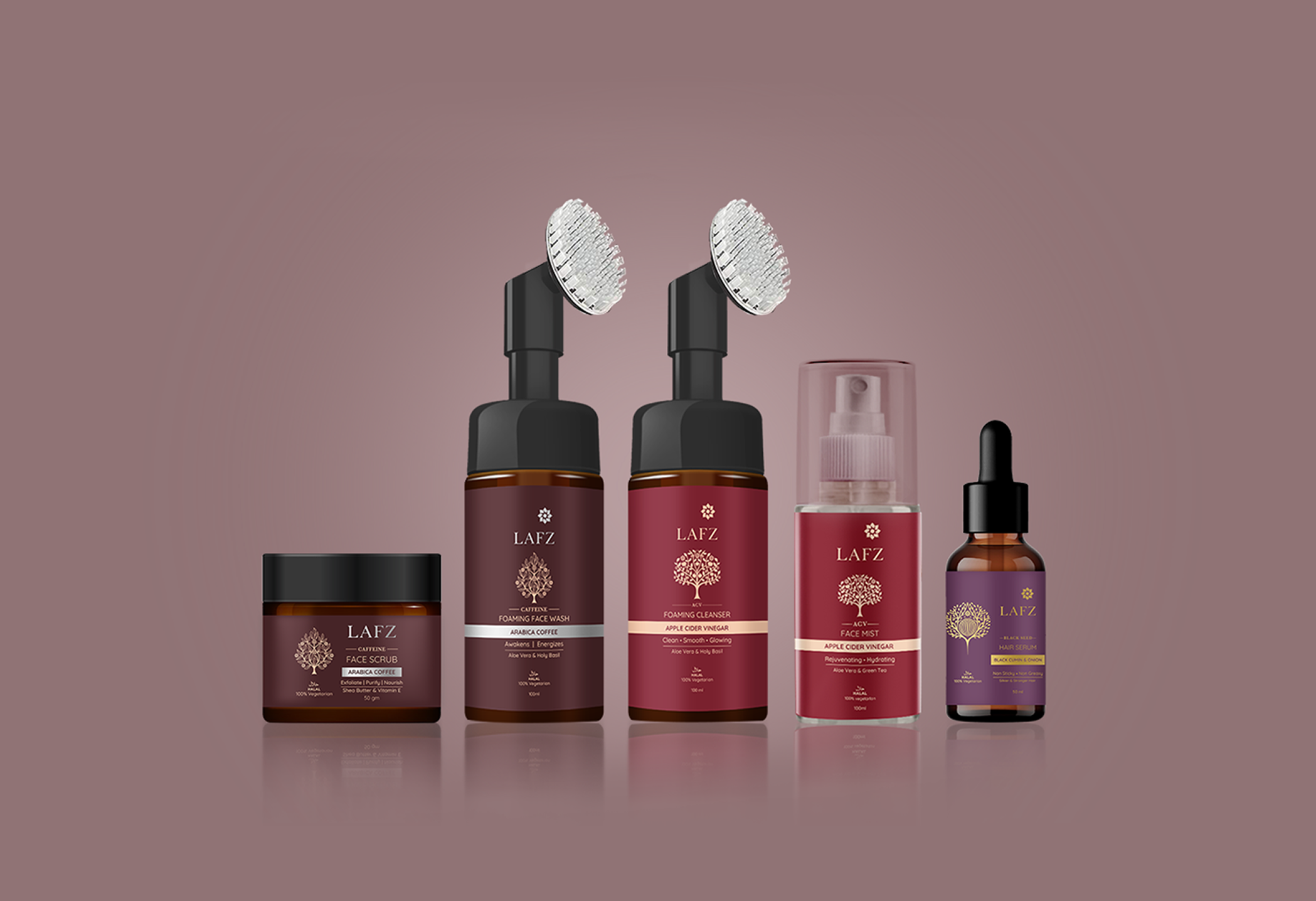
A Cohesive Collection Designed to Grow
The Lafz packaging system was designed as a scalable brand identity a visual architecture that holds the entire collection in coherent relationship while giving each product the individual character it deserves. The collection reads as a family on the shelf: distinct products, unified brand. As Lafz expands its range new formulations, new product types, new market opportunities the packaging system can accommodate that growth without losing the coherence that makes the brand recognisable. This is luxury packaging design thinking applied to an accessible wellness brand: the rigour of premium brand identity, in service of a brand that makes no claims about being premium. Only about being true.