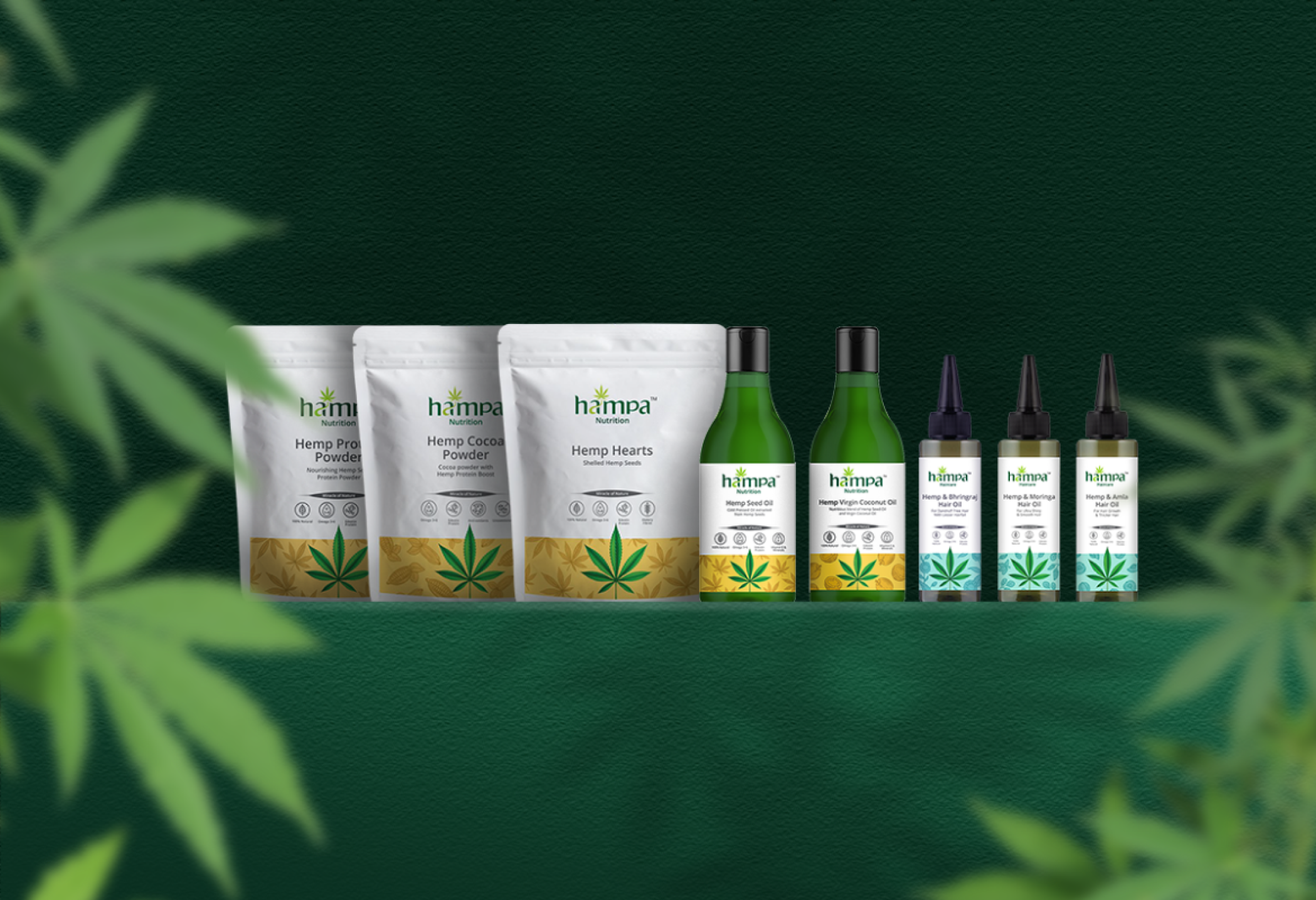
Hampa's Packaging
Celebrating Nature's Miracle
Nature Made Visible; Sustainable Packaging Design for a Wellness Brand
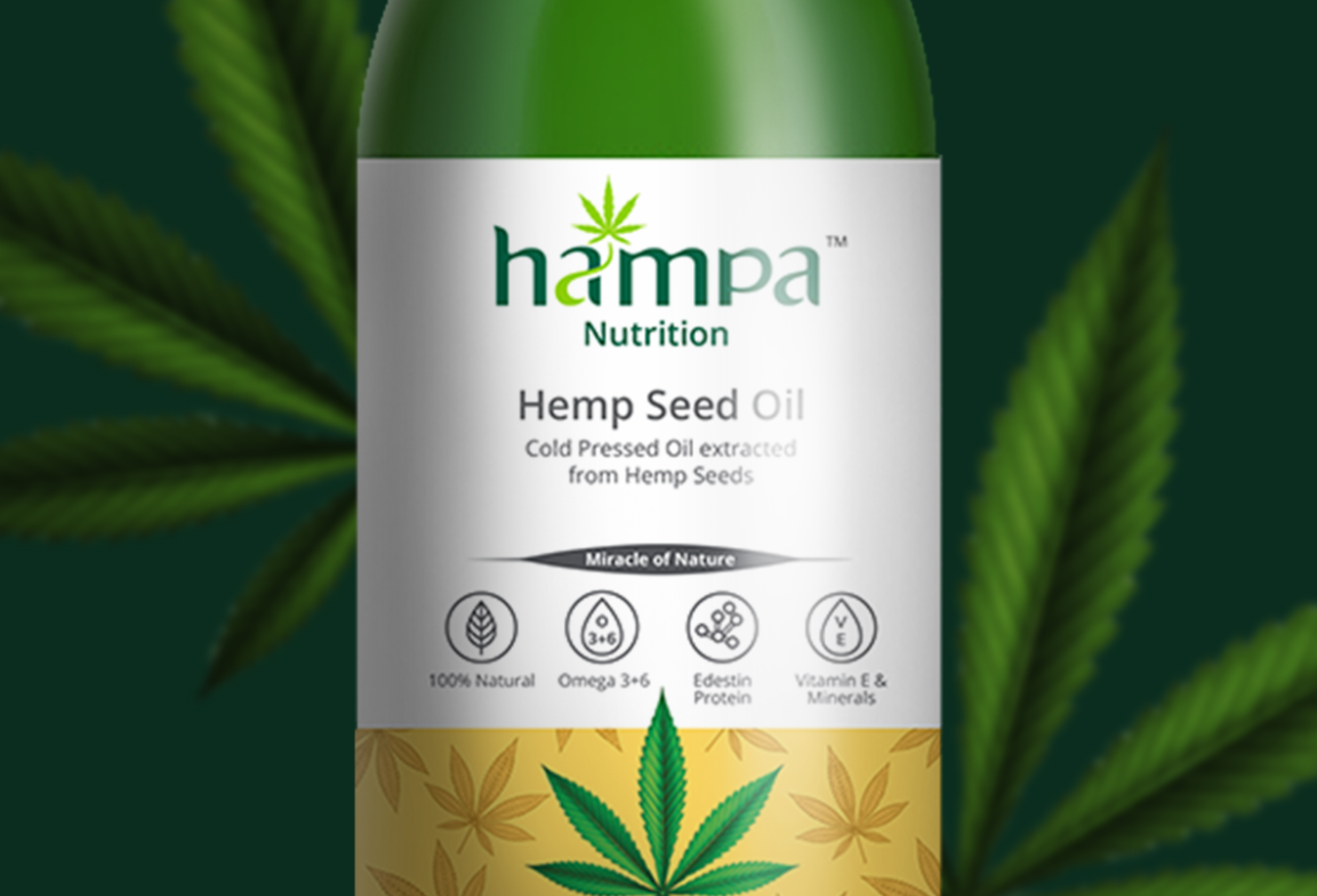
Hampa's founding premise is that nature has already solved most of the problems that modern wellness brands claim to be addressing. The packaging design brief for Hampa was to make that premise visible to create a packaging system in which the material, structural, and visual choices all communicate the brand's relationship with nature, without resorting to the visual shorthand that makes most eco-wellness packaging look identical. Studio ABD approached the Hampa packaging design as an exercise in honest materials: using sustainable packaging components not as a brand claim but as a design decision that the consumer can see, feel, and verify.
Premium Without Pretence — Eco-Responsible Packaging at Its Most Elegant
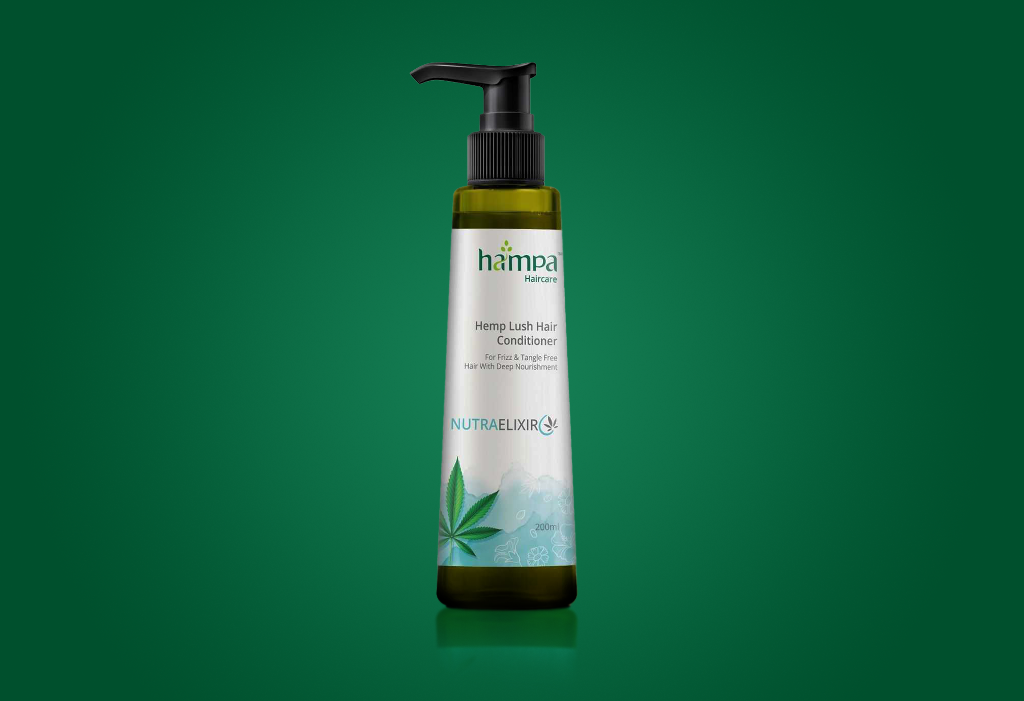
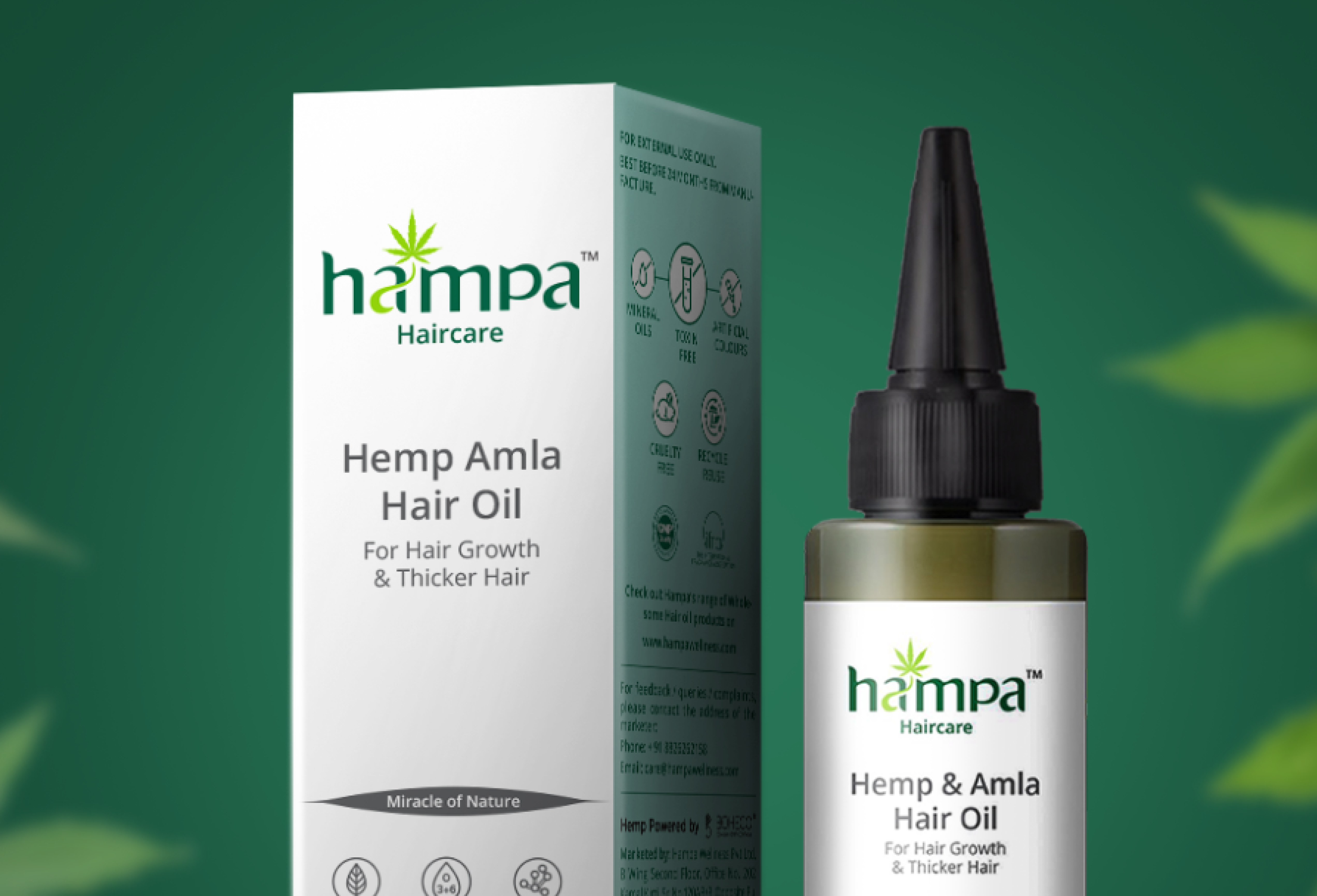
Sustainable packaging and premium positioning have often been presented as competing choices as if the commitment to responsible materials necessarily requires the sacrifice of visual quality. The Hampa packaging design disproves this assumption comprehensively. FSC-certified boards, water-based finishes, and structural designs that eliminate unnecessary material without compromising structural integrity were combined with a visual system of botanical intelligence and typographic precision that places Hampa comfortably in the premium wellness segment. This is eco-responsible packaging that earns its shelf position not through its sustainability credentials but through the quality of its design and in doing so, makes the most powerful possible argument for sustainable packaging as a design standard.
.png)
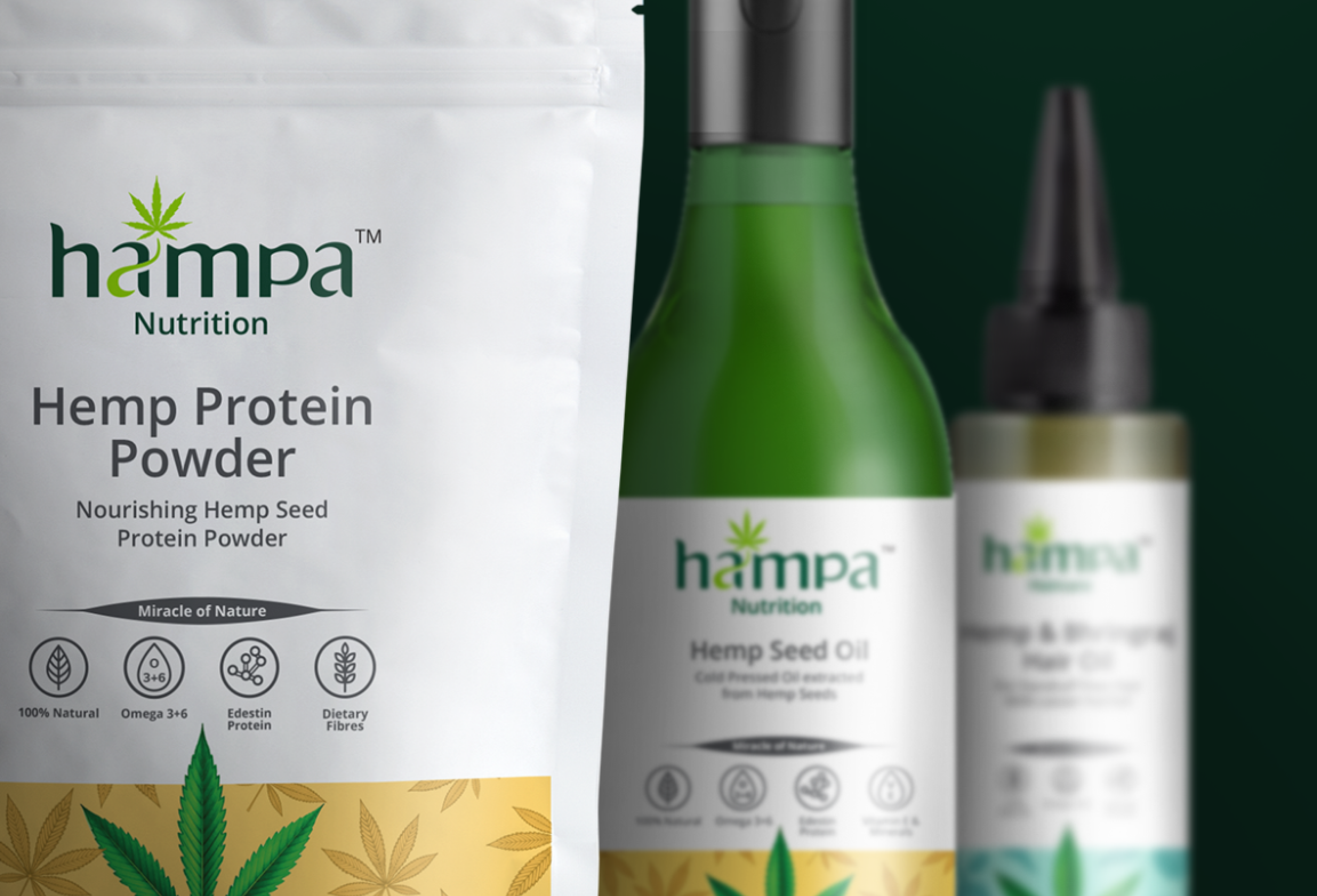
The Brand Promise, Made Physical
The measure of a packaging system for a brand like Hampa is whether it tells the truth. Not the aspirational truth of a marketing brief, but the material truth of a brand that genuinely believes what it sells. Every choice in the Hampa packaging the weight of the board, the texture of the surface, the restraint of the colour palette, the precision of the structure was made to communicate integrity. The packaging does not claim to be sustainable; it is sustainable, and the design makes that visible. It does not claim to be premium; it is premium, and the material quality confirms it. When packaging design is this honest, it becomes the brand's most powerful expression of what it actually stands for.